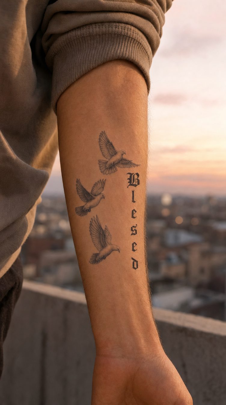

There is no single-number answer to how small a text or fine-detail tattoo can be, because the minimum size depends on three different things from one design to another: the distance from which the tattoo will usually be viewed, how close the lines or letters are to one another, and how permanent tattoo ink behaves in the skin over time. A thin, tightly spaced font can become hard to read at a height where a bold font with more generous spacing remains perfectly clear. For this reason, the exact threshold in millimeters is determined with the tattoo artist for each design individually—but the mechanisms behind this decision are the same for any design and can be understood before your consultation.
- Details next to one another merge in the eye below a certain visual angle, so a design viewed from farther away needs larger letters and lines to remain distinct.
- Line thickness and the spacing between letters matter just as much as their height; at the same height, a fine script font needs more reading space than a bold, simple font.
- Over time, the pigment in a permanent tattoo moves slightly deeper into the skin, and lines that are already very close together lose clarity sooner than those with somewhat more generous spacing.
- A semi-permanent test at the actual size shows how the design reads right now; it cannot show how permanent tattoo ink will behave years from now.
Why the exact size matters for a text or fine-detail tattoo
A drawing or text looks completely different at its actual size on the skin than when enlarged on a phone screen or in a printed sketch. At zoom, every letter looks clear and every line looks well defined; the problem only appears when the design is reduced to a few centimeters, the space it will actually take up on your arm, wrist, or ribs. The human eye has a physical limit to its resolution: below a certain visual angle, nearby details merge into a single shape, no matter how precisely the original design was drawn (source: Visual acuity - Wikipedia).
If you want a broader framework for choosing a size—the fit between small, medium, or full body and the area of the body—our guide to choosing the right size for different body areas covers exactly that. Here, we focus strictly on the letters and lines themselves: what makes them legible and what turns them into an indistinct mark at a small size.
Small letters, clear reading: what affects the minimum height
The farther away the tattoo will be viewed from, the larger its details need to be to remain distinct to the eye. A quote worn on the inside of the forearm, usually read from 20-30 cm away, can keep smaller letters than one placed on the shoulder or calf, where the viewer is normally a meter or two away.
Letter height matters less than line thickness and the space between the letters: tall letters that are crowded together still become hard to read, because the eye can no longer distinguish the edges of each shape. At the same height, a thin font—script or fine serif—needs more reading space than a bold, simple font, precisely because its lines are already close to the minimum thickness the skin can render clearly.
Why exact thresholds in millimeters are determined with the tattoo artist, not from a universal chart
Each combination of font, body area, and skin type slightly changes the answer to the question of how small a text can be. A tattoo artist who often works with small lettering can look at your specific design and estimate whether a certain height will remain legible over time in the chosen location; a generic chart intended for every font and every body area cannot account for these differences. That is why the exact threshold remains a specific discussion with the tattoo artist, not a fixed number that applies to every design.

Fine details and closely spaced lines: what changes over time
The explanation above relates to legibility at the time of application. A second mechanism comes into play over time: the pigment in a permanent tattoo moves slightly deeper into the skin as the years pass, and lines that are already very close together tend to lose clarity sooner than those with somewhat more generous spacing (source: Tattoo - Wikipedia).
In practice, a design with lines at the limit of how close they can be starts with less room for change over time than one with somewhat more generous spacing between them, even if both look equally clear on the first day. A semi-permanent test shows what the design looks like now, at its actual size; it cannot show how the lines will behave years from now with permanent ink, at a different depth in the skin, because the depth and composition of the ink differ from one type of tattoo to another.

How to test the actual size before getting a permanent tattoo
Apply the design at the size you are actually considering for the permanent tattoo, not an artificially enlarged version made to look impressive at that moment. A test at a larger size than the actual one tells you how a different design looks, not the one you are about to wear.
Then look at it from the distances at which it will usually be seen: up close, in the mirror, when you look directly at it, and from a meter or two away, during a normal conversation—because that is exactly the range where you can see whether the letters remain distinct or begin to merge.
If you are hesitating between two similar sizes, the simplest thing is to test them one at a time or even in parallel on different areas of the skin, so you can compare the difference in legibility directly instead of trying to guess from memory.
What a semi-permanent test can and cannot confirm
A semi-permanent test can confirm whether the text or design remains clear at the size and distance from which it will usually be viewed, and whether the chosen size looks right on the area of skin where you want it.
What it cannot confirm is how permanent tattoo ink will behave over time, because the depth, composition, and healing process differ from those of a temporary or semi-permanent design. A detailed discussion of exactly what a test can and cannot show before a permanent tattoo is covered in the article on the limits of a temporary test before getting a permanent tattoo. The discussion with your tattoo artist remains the final step in validating the exact threshold that suits your skin and design, especially when you are approaching the lower limit of what still seems legible.
Next step: from an on-screen test to a skin test
Choose one or two size options for the design you are interested in and apply them as a semi-permanent test at the actual size you are considering, not an intermediate version designed only to look good in the moment. For more small designs to start a test like this, the Small Temporary Tattoos collection brings together suitable options to start with.
For a broader framework for your first tattoo decision—from choosing the design to placement—our Your First Tattoo hub brings the essential steps together in one place, while the article on why it is worth testing a design before making it permanent explains the benefits of this kind of test in detail. For a complete, step-by-step testing protocol over several days, the article on testing a tattoo before making the final decision goes into details we do not repeat here, and if your hesitation is about choosing a font for lettering, the guide to choosing the right font for a lettering tattoo covers that topic separately.