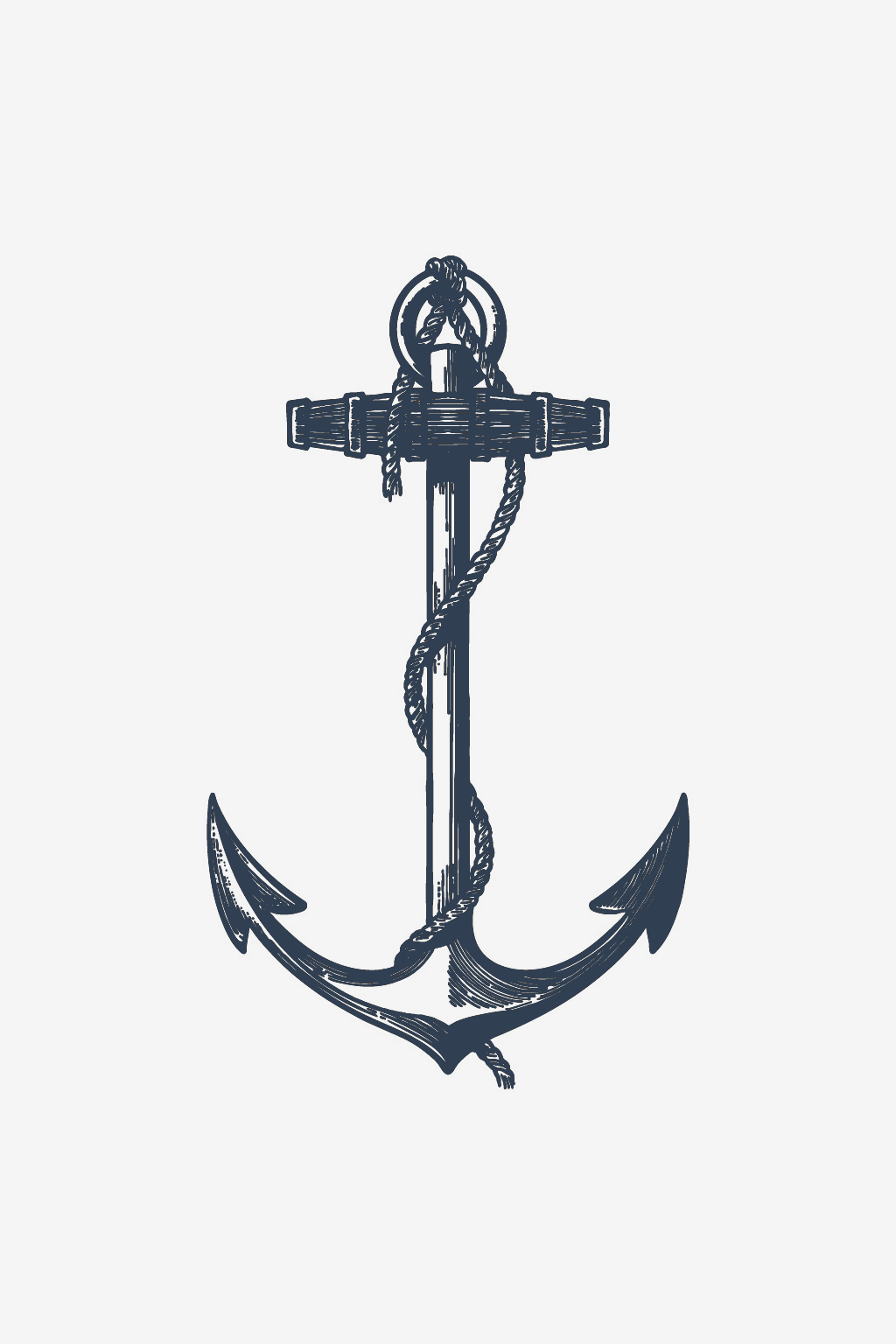

If you have a personal image—a drawing, a scanned sketch, a logo or a lettering composition—and want to turn it into a custom temporary tattoo, the first obstacle is not choosing the design, but the quality of the file itself. Four things determine whether a design comes out clearly when printed at a small size: its resolution or vector format, the contrast between the lines and the background, the minimum line thickness, and how the file’s proportions fit the area where it will go. Checked at the actual size the design will be worn, not the original size of the photo or scan, these four points tell you whether the file is ready or needs more adjustments before moving forward.
- Check the file’s resolution at the final print size, not at the original size of the photo or scan.
- Where possible, choose a vector file, especially for drawings with fine lines or text.
- Scale the design down on screen to the actual size it will be on your skin, and check whether the fine lines remain distinct from one another.
- Choose the size category—small, medium or full body—based on the design’s actual shape, not just the size you like most.
What type of file works best for a tattoo design
A vector file is built from mathematical paths, not a fixed grid of pixels, so it can be enlarged or reduced—whether for a subtle wrist design or a larger piece—without the edges losing their clarity (source: Custom Ink — Image Resolution 101). A photo taken with a phone or a scanned sketch, on the other hand, is a raster file: it will hold up only if it already has enough resolution at the size it will actually be printed, with approximately 300 dpi measured at that final size being a benchmark frequently cited by print shops, not at the size of the original photo on the phone (source: Print-Tattoo — Which file formats are accepted?).
The difference matters more for a personal design than for one chosen from a catalog, precisely because the source file—a photo of a drawing on paper, a screenshot from a notes app, a scan from an artist friend—was not designed for printing from the outset. For a hand-drawn design, the safest move is to turn the sketch into a clean vector file—on your own or with the help of a designer—before it goes near any printer, especially when the drawing has fine details or lines that come close together.
Why contrast and continuous lines matter
Lines placed close together or with poor contrast against the background are the first thing to merge into a single dark blot when the design is reduced to tattoo size, even if, on screen at full size, the difference between them seems obvious (source: Sticker Mule — recommended line thickness). Continuous outlines, without small gaps or broken paths, matter much more for a design meant to be printed small than for a mockup viewed large on screen, where the eye fills in the gaps that would remain visible at actual size.
Whether a future fully custom order at InkLabs will accept only solid black artwork or also allow color or metallic shades depends on the exact product through which the order will be placed, and this detail could not yet be confirmed on a live product page. For this reason, treat the recommendations here as general guidance for any temporary tattoo file, not as a fixed InkLabs rule, until the information is verified directly on the relevant product page.


How thick should fine lines be
Thin lines are the first detail to disappear or merge when a design is reduced, which is why print shops generally require a minimum line thickness instead of leaving it to chance (source: Sticker Mule). However, the two verified benchmarks come from different contexts and do not combine into a single range: Sticker Mule gives the minimum thickness in typographic points—approximately 1pt for a standard print, more for a less uniform surface such as a T-shirt or cap, which means about 0.35-0.7 mm depending on the surface (source: Sticker Mule), while Print-Tattoo separately mentions a minimum thickness of approximately 0.5 mm specifically for colored or metallic lines (source: Print-Tattoo). These figures are useful as a sense of proportion from other types of print, not as a specification published by InkLabs for a particular product.
A simple test that applies to any file: scale the design down on screen to the actual size it will be worn, and check whether the finest lines remain distinct from one another or are already starting to stick together. If, in that test, two lines that were clearly separate in the original end up touching, that’s a sign that either the lines need to be thickened a little or the space between them needs to be increased before the file moves forward.
How the design size relates to the small, medium and full-body options
The InkLabs size guide describes the three options more in terms of feel and placement than by a fixed measurement: a small, subtle piece for the wrist, finger or ankle; a medium, more visible piece for the forearm or shoulder blade; and a full-body piece designed to stand on its own as a focal point. You can see the full descriptions and placement recommendations in the InkLabs guide to choosing a tattoo size.
At the file-preparation stage, the ratio between width and height matters more than the exact size. As a hypothetical example: a tall, narrow design originally intended for a forearm needs real adjustments—not just a simple reduction—to work on a more rounded area such as the shoulder, because the original proportions simply do not follow the contour of that area. Exact dimensions in centimeters for each size category can vary from one product to another, so the safest approach is to check them directly on the product page when ordering instead of starting from an assumed figure.
Common mistakes that delay or ruin a custom design
A few issues come up repeatedly in files submitted for printing, and most have a simple cause that can be identified and avoided early:
- Sending a screenshot of the design instead of the original file or a properly rescanned version, which reduces the resolution without the sender immediately noticing.
- Keeping a white or colored background around the design instead of isolating it, so the background appears as a visible border around the design once printed.
- Skipping the test of reducing it to its actual size, which is why text or fine lines that look perfect on a laptop turn into a blurry blot at tattoo size.
- Not converting text to outlines when the design was made in a graphics program, which can change or shift the letters without the creator realizing it when the file is opened on another computer (source: StickyLife — Artwork Guidelines).
Frequently asked questions about preparing a file
What resolution should a temporary tattoo design have?
For a raster file (photo or scan), the benchmark used by print shops is approximately 300 dpi measured at the actual print size, not at the original file size. A vector file does not have this limitation because it scales without losing clarity.
How thick should the lines in a tattoo design be?
There is no single figure that applies everywhere, and the two verified benchmarks should not be combined because they come from different measurement systems: Sticker Mule gives the minimum thickness in typographic points, about 0.35-0.7 mm depending on how uniform the surface receiving the print is, while Print-Tattoo separately mentions approximately 0.5 mm specifically for colored or metallic lines. The most useful test is still to reduce the design to its actual size and visually check the finest lines.
What size should I choose for a custom temporary tattoo?
The choice depends first on the area and how visible you want the design to be—small for the wrist, finger or ankle, medium for the forearm or shoulder blade, full body for a central piece—and only then on the proportions of your file, which need to fit the shape of that area. Check the exact size details for each category on the product page you choose.
If you don’t have a file ready yet
At the moment, customizing an InkLabs order means choosing an existing design from the catalog and adding a size, placement or combination of several designs in a single composition—you can see exactly which options are currently available in the article about customizing temporary tattoos at InkLabs. It’s a useful starting point while the fully custom order option, with your own uploaded file, is still in the works, and it’s worth checking the size guide first to see how a design will actually look on your chosen area.
None of this stops you from preparing your personal file right now by following the points above, so it’s ready when the fully custom option becomes available. If you’re working from someone’s handwriting, the guide to scanning and cleaning up a handwriting sample covers the details specific to that process. If the source is a child’s drawing, the article about turning a child’s drawing into a tattoo explains step by step how to photograph and vectorize it properly. And once the design and size are set, the guide to applying a temporary tattoo at home shows exactly how to transfer it onto your skin.